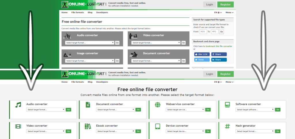
If you have visited Online-Convert over the past two weeks, you might have noticed one very prominent change. We have a new front page design!!!
Don’t worry, nothing else has changed. The front page is simply easier to access and navigate. If you are used to the old design, however, we’re here to look at the major differences. Let’s go!
What Changed?
1. The Menu
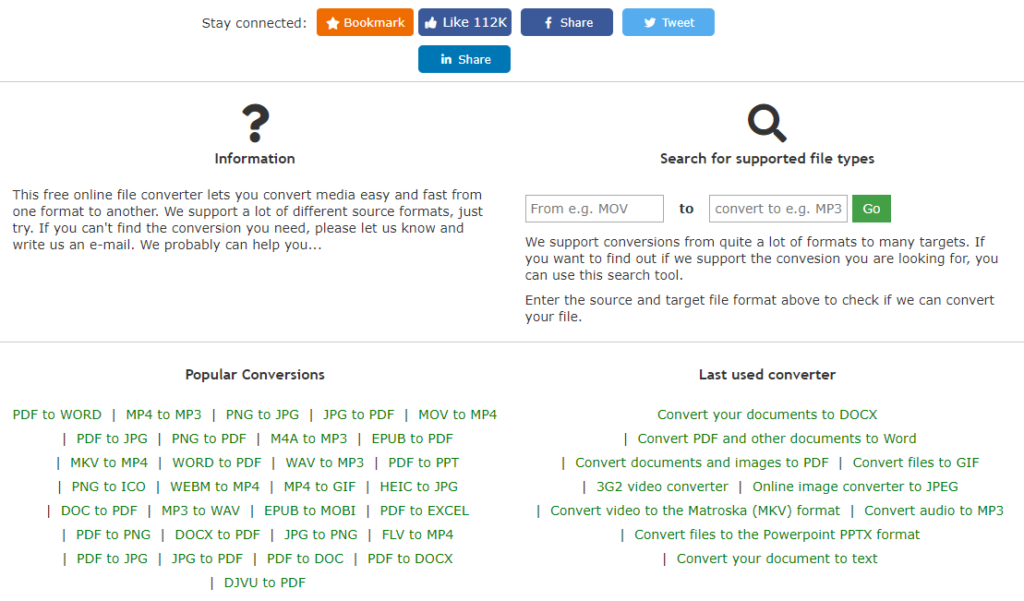
The most striking difference is surely the “disappearance” of the menu on the right side. Formerly, it showed the search where you can check whether your conversion is supported, as well as possibilities to share the page to social media. Furthermore, there was a list of the last used converters and the most popular conversions.
How to use the Online Convert Search
Don’t worry, the search, lists, and buttons are still there. They just moved below the main focus, the converters themselves.

2. The width
The old design had a fixed width with the content in the middle of the page. A lot of space was lost to the left and right that way.
Now, the converters span over the whole width of your browser window! This might be only apparent for people using bigger screens on their desktop computers, but for them, it really makes a difference.
3. The Color
Out with the old and gray and in with the new and sleek.
The converter overview was made of gray boxes or tiles previously. Now, they look sleeker, brighter, and with more descriptive icons to indicate what converters you are dealing with. It gives everything a much more modern and clean look. Don’t you agree?

What Didn’t Change?
1. The Overview
Except for the color and icons, the boxes with all the converters did not change all that much. Quite the contrary, we added to them! You may have spotted the new Software converter already as well as a PDF to Word and PDF to JPG converter.
This means that everything is still where you are used to, it’s just the “make up” that changed.
2. The Service
Of course, the conversions did not change either! Everything works just as fast and reliable as it always did!
